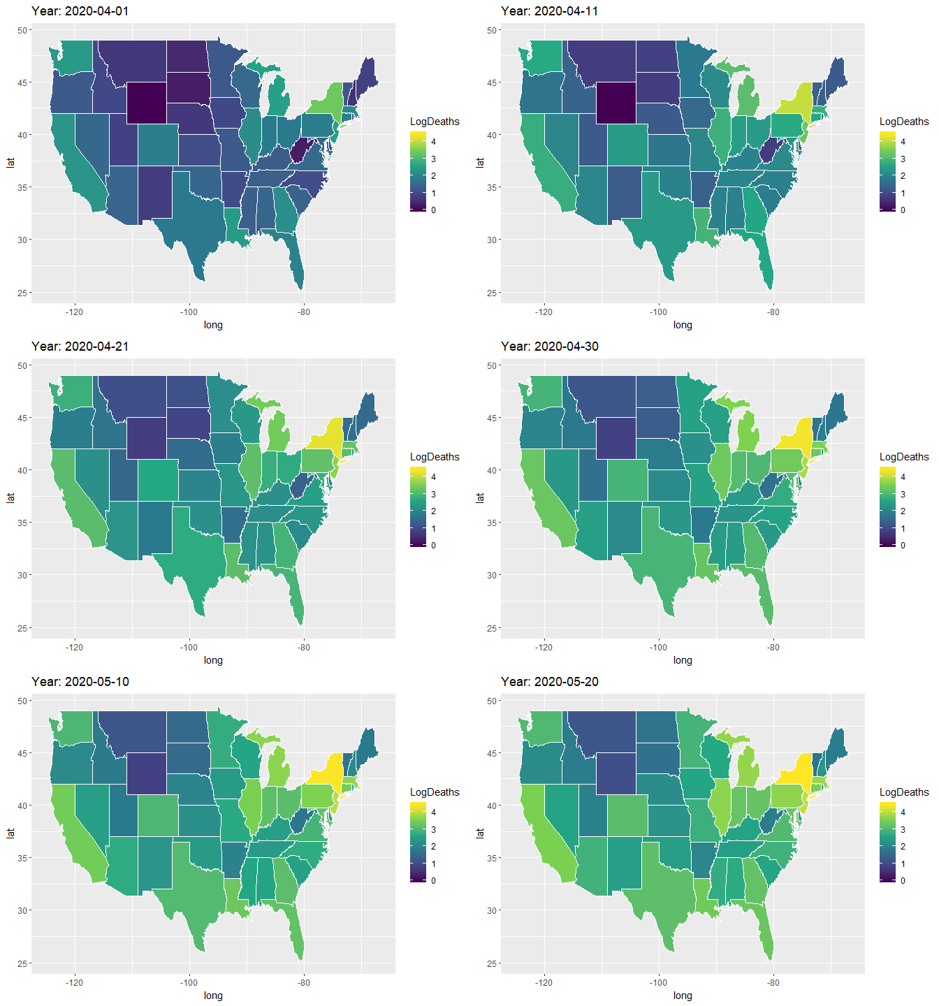
This tutorial shows the step by step process of how to build an animated map of US states displaying Covid cases and deaths for each state. This tutorial is in R – basic familiarity with R is assumed.
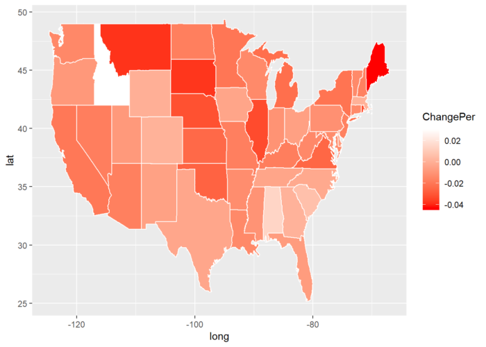
With this tutorial, you will be able to easily make the animated map like shown above or a static map like below of percentage population change for US states between 2018 and 2019.
The iframe below embeds the HTML output of the RMarkdown file used for creating the tutorial.

